Unit 55: Graphic Narrative Task 1
Working with Panels (Composition, Lighting, and
Colour)
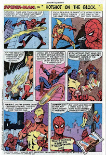
The arrangement of images on this page, allows panels overlap with each
other. The significance of this is overlapping, is that:
1) It gives the effect that everything is happening very fast, which
is perfect for the current scene that is filled with action.
2) Doing this can also fit more images on a page, and cover images
that are unneeded.
3) Overlapping images like this also connects all the images
together leading to easier reading.
It’s interesting because the
image is going out of the panel. This connotes that a very fast/strong moving
object (in this case it’s a fireball), this is useful if you want to show a
powerful object and grab readers attention.
Each background present a different
atmosphere for the characters to be in. The bottom right, is red, orange, and
yellow. This communicates loudness and energy which is fitting for the scene
going on. The colour palette for top left only uses two colours - black and
white, while bottom left uses mid-tones (black, white & different shades of
them) as well as yellow/red for the important part drawing in your attention.
Top right has many different shades of greys, with some colours like
red/yellow/brown to add definition.
Composition – the characters are centred in
the middle of the panel, making them the centre of attention, and lets the
reader more easily concentrate on what’s happening and read the flow of the
speech bubbles.
Lighting and colour – the three main
characters are also shown as black silhouettes, this can be done to show the
importance of the characters that are silhouettes, but also to change up the
colours and give the panel a unique look. This can help make the comic more
interesting and diversify the panels.
Composition – extremely close-up of the
character. This lets the artist draw more detail, and the reader sympathise
with the character and really feel their emotion.
Lighting and colour – bright colours, that
draw in the reader. The face is also mostly made of yellow tones, and the
background is purple – the complementary colour of yellow. This contrasts with
the character and brings them forward.
Composition – mid-shot. The character in
front is laying on the ground, while the character behind towers over him. This
gives the feeling that the character in front is weak or ashamed. Further
accentuated by the fact that he is covering his face.
Lighting and colour – Colours used here are
not very notable. However, it is interesting to note the character that feels
weak is blue, and the character that looks strong is red – both colours convey
a feeling. Blue connotes sadness, and misery, while red is strength and power.
First panel – mid shot. Two
figures, action, point of view is the eye line. Action is conveyed through this
panel, the figure is being punched, and the impact is shown through the text
and action lines.
Middle/left panel – long shot/looking up. When the camera is looking
up at the character, it usually means the character in view is powerful. This
makes the character on the right look more strong.
Last panel – low shot. Shows
the character is weak, and losing.

In this comic, almost all the frames are overlapping each other. And
with the point of view constantly shifting, for example, the first panel is an
establishing shot. Panels 3,4 and 5 are mid shots, and panel 7 is a low shot. This
gives the effect of a very fast paced action sequence taking place.
Last panel – detail/close up
shot. The camera/reader is looking up at the person falling, this gives the
effect that the superhero is falling fast and the fact that it’s a detail shot
mean we can really relate to the character falling down.
First panel/right panel – detail shot. We can
see the fear on his face and sympathise with him.
First panel/left panel – looking up shot.
Almost everything in this panel is a silhouette. This makes us really feel
scared for the character falling with the buildings around him, as a silhouette
shot conveys drama and mystery.


No comments:
Post a Comment